How to Build a Visualization
Let's learn how to create a custom visualization with our Visualization SDK and embed it to your dashboard. You can also go directly to the examples folder in your downloaded library/repository to check all available prebuilt examples.
Steps:
- Get the data.
- Set up a visualization.
- Embed the visualization.
Sometimes when the data visualization library requires more complex input, you must transform your data:
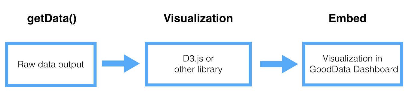
Get the data from the GoodData Platform
Getting the data from the GoodData Platform is a critical part. Because this step will be the same for every data visualization you must know the structure of the data that is extracted from GoodData.
Learn the details >>Set Up the Visualization
Set up for a visualization always unique and depends on which visualization library you are using.
The best way to learn how to set up an individual Visualization is to explore our example library below. Or definitely read other related Google Charts, D3.js or dc.js tutorials.
Learn how to setup visualization (D3.js) >>Embed the Visualization in a Dashboard
You can embed the custom visualization the same way as any other html content. However, since visualizations are javascript running outside of the GoodData Platform, several limitations exist. We strongly recommend you to go through these details.
Learn how to embed the visualization >>That's it!
Check out all examples we have prepared for you. You can play around with them and create new examples and share them with others.