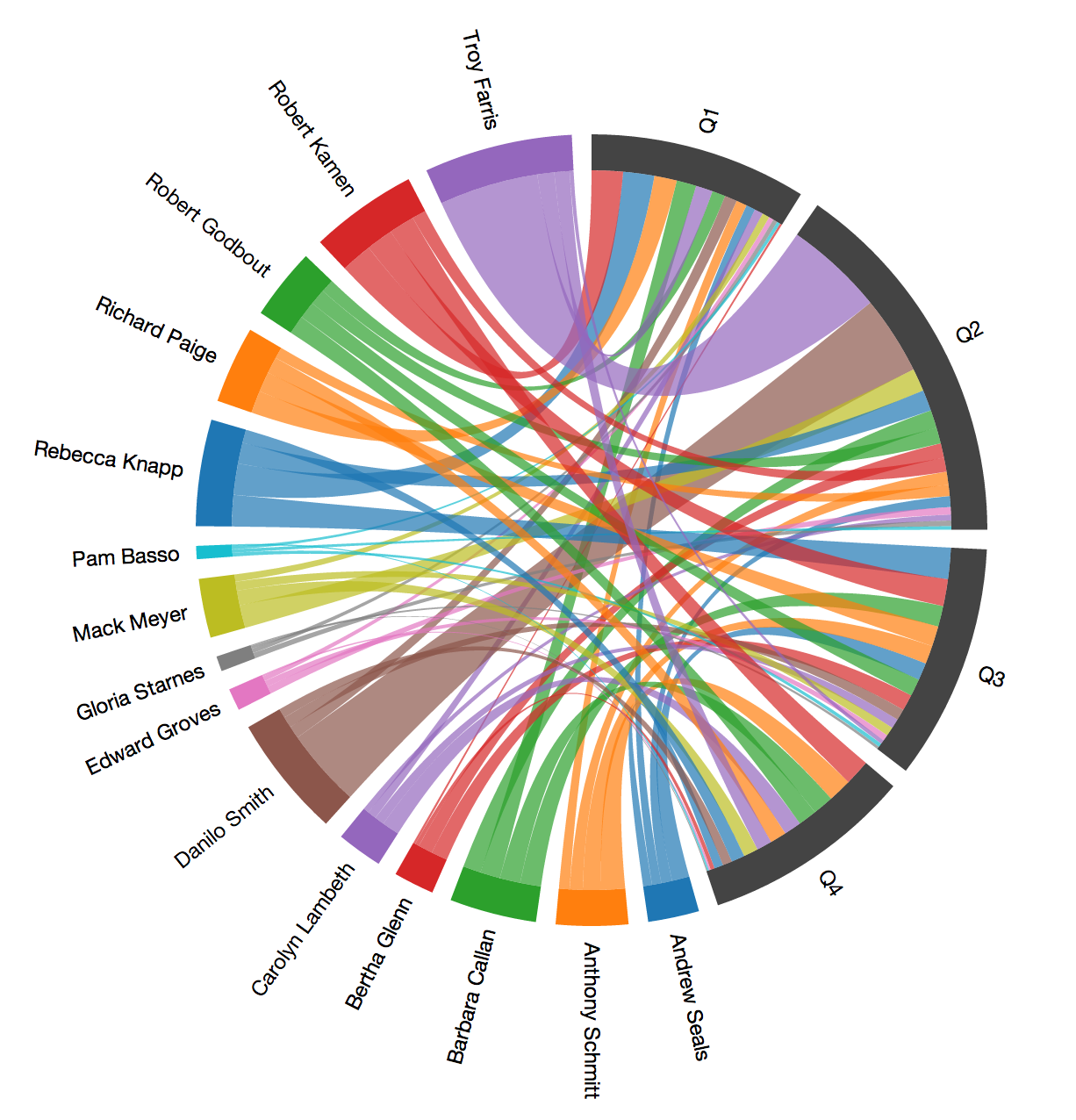
Visualize Sales Data using a Chord Chart
Let’s learn how to build chord chart that shows you how each sales person contributed to the quarter sales results:
More info about setting up D3.js Chord chart. You also find complete example.
1) Get the data
First of all select metric and attributes that you want to use in your visualization.
Remember that you must specify an object identifier. The example can be label.opp_owner.id.name for attribute (Opportunity Owner) or afSEwRwdbMeQ for fact (Sales Amount).
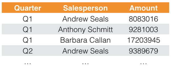
See the example output below. The data is exported in a raw format. Data is not cross-tabulated. Let’s see how it looks in Javascript.
var projectId = 'PROJECT-ID',
    user = 'USERNAME',
    passwd = 'PASSWORD';

// Report elements identifiers from which we execute a GD report
var metric = 'METRIC-IDENTIFIER', // sales
    attr1 = 'oppclose.aam81lMifn6q', // opportunity close quarter
    attr2 = 'label.opp_owner.id.name'; // opportunity owner

var elements = [attr1, attr2, metric];

// Insert info label
$('body').append('<div class="login-loader">Logging in...</div>');

gooddata.user.login(user, passwd).then(function() {

    $('div.login-loader').remove();
    $('body').append('<div class="loading">Loading data...</div>');

    // Ask for data for the given metric and attributes from the GoodData project
    gooddata.execution.getData(projectId, elements).then(function(dataResult) {
        // Yay, data arrived

 // Remove loading labels
        $('div.loading').remove();

// ... ... REST OF CODE - see below ... ...

});
The key part is the getData() method that calls the GoodData APIs and gives you data result for specified elements.
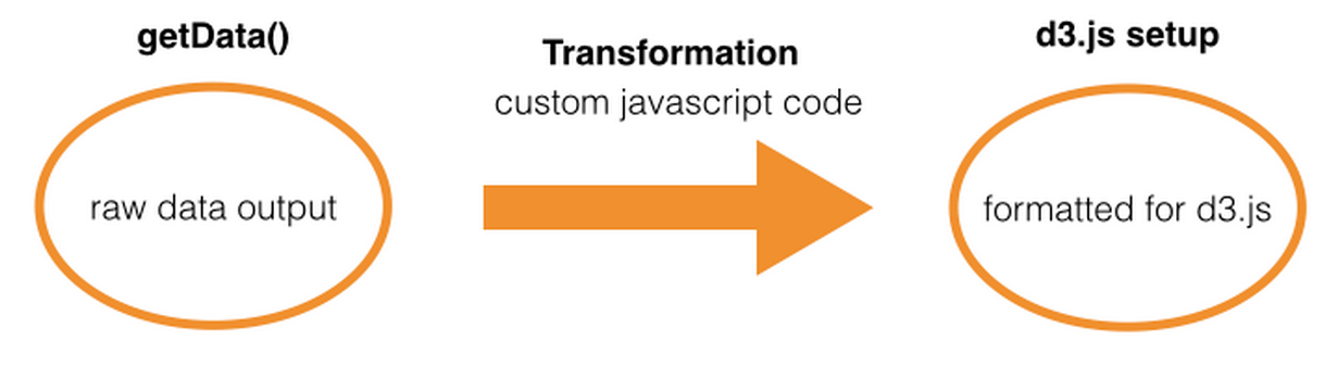
2. Transform data
In our first tutorial, we didn’t need any kind of data transformation because the data was ready to send to the D3. We need to do this now. This part always depends on what data you are extracting and what type of visualization you want to create. It is a fully custom javascript code.
We basically transform the data to fit the D3.js data input definition. Sometimes this can be quite complex task to solve. In our example we must transform the raw data output that looks as follows:
to the matrix that is being consumed by D3 visualization. Check out the resulting matrix:
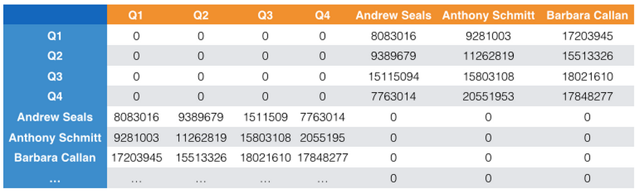
What you can see from the matrix above is contribution of each salesperson to the Quarter Revenue. You can see that Andrew Seals brings in 8083016 revenue in the Q1 and 9389679 revenue in Q2. This is what D3 Chord chart needs as the input. If you go row by row, you can see that there is zero value between each quarters and each sales person. It is correct because they are not contributing to each other.
The complexity here is to transform the data we receive from GoodData to this format. This is done by the transformData function.
var transformData = function(dataResult) {
            var headers = dataResult.headers.map(function(h) {
                    return h.title;
                }),
                data = dataResult.rawData,
                length = data.length,
                attr1 = headers[0],
                attr2 = headers[1],
                metric = headers[2],
                attr1Keys = {},
                attr2Keys = {},
                matrix = [];

            // Compute metric values for both attributes values and store them in hashmap
            data.forEach(function(row) {
                var key1 = row[headers.indexOf(attr1)],
                    key2 = row[headers.indexOf(attr2)],
                    metricVal = parseFloat(row[headers.indexOf(metric)]);

                if (!attr1Keys[key1]) attr1Keys[key1] = [];
                if (!attr2Keys[key2]) attr2Keys[key2] = [];
                attr1Keys[key1].push(metricVal);
                attr2Keys[key2].push(metricVal);
            });

            // Get the keys in an array
            var attr1Vals = Object.keys(attr1Keys),
                attr2Vals = Object.keys(attr2Keys),
                matrixIdx = 0,
                i = 0;

            // Initialize result matrix
            for (i=0; i<attr1Vals.length+attr2Vals.length; i++) matrix.push([]);

            // For each key in an array generate a row in a resulting matrix
            attr1Vals.forEach(function(attrVal) {
                // Generate leading zeros
                for (i=0; i<attr1Vals.length; i++) matrix[matrixIdx].push(0);
                matrix[matrixIdx] = matrix[matrixIdx].concat(attr1Keys[attrVal]);
                matrixIdx++;
            });

            // For each key in an array generate a row in a resulting matrix
            attr2Vals.forEach(function(attrVal) {
                // Generate leading zeros
                matrix[matrixIdx] = matrix[matrixIdx].concat(attr2Keys[attrVal]);
                for (i=0; i<attr2Vals.length; i++) matrix[matrixIdx].push(0);
                matrixIdx++;
            });

            return {
                labels: [].concat(attr1Vals.concat(attr2Vals)),
                matrix: matrix
            };
};- Setup the D3 Visualization
This part really depends on the visualization type you use. We are using chord chart
        var fill = d3.scale.category10();

        // Use the helper function and transform the data
        var data = transformData(dataResult);

        // Visualize
        var chord = d3.layout.chord()
            .padding(.05)
            .sortSubgroups(d3.descending)
            .matrix(data.matrix);

        var width = 960,
            height = 500,
            r1 = height / 2,
            innerRadius = Math.min(width, height) * .41,
            outerRadius = innerRadius * 1.1,
            outer

        var svg = d3.select("body").append("svg")
            .attr("width", width+200)
            .attr("height", height+200)
            .append("g")
            .attr("transform", "translate(" + (width+200) / 2 + "," + (height+200) / 2 + ")");

        svg.append("g").selectAll("path")
            .data(chord.groups)
            .enter().append("path")
            .attr("class", "arc")
            .style("fill", function(d) {
                return d.index < 4 ? '#444444' : fill(d.index);
            })
            .attr("d", d3.svg.arc().innerRadius(innerRadius).outerRadius(outerRadius))
            .on("mouseover", fade(.1))
            .on("mouseout", fade(.7));

        svg.append("g")
            .attr("class", "chord")
            .selectAll("path")
            .data(chord.chords)
            .enter().append("path")
            .attr("d", d3.svg.chord().radius(innerRadius))
            .style("fill", function(d) { return fill(d.target.index); })
            .style("opacity", 0.7);

        svg.append("g").selectAll(".arc")
            .data(chord.groups)
            .enter().append("svg:text")
            .attr("dy", ".35em")
            .attr("text-anchor", function(d) { return ((d.startAngle + d.endAngle) / 2) > Math.PI ? "end" : null; })
            .attr("transform", function(d) {
              return "rotate(" + (((d.startAngle + d.endAngle) / 2) * 180 / Math.PI - 90) + ")"
                  + "translate(" + (r1 - 15) + ")"
                  + (((d.startAngle + d.endAngle) / 2) > Math.PI ? "rotate(180)" : "");
            })
            .text(function(d) {
                return data.labels[d.index];
            });

        // Returns an event handler for fading a given chord group.
        function fade(opacity) {
            return function(g, i) {
            svg.selectAll(".chord path")
                .filter(function(d) { return d.source.index != i && d.target.index != i; })
                .transition()
                .style("opacity", opacity);
            };
        }
    });
That’s it. You are ready to embed your new visualization to the GoodData Dashboard. If you are not sure how to do it read the embedding tutorial.