Why GoodData.UI?
The purpose of this document is to describe a proven design pattern for creating a modern analytical or data exploration application.
We will also introduce an open-source reference implementation of the ideas described in this document.
Before we dive deeper into the technical topics, let’s first discuss what interactive analytical applications are, and more importantly, why you should care about them.
What is it for?
If you are developing a B2B application, you may have noticed that the requirements for the user interface have changed over the last few years.
Your customers have always purchased your software because it made employees more efficient.
Traditionally, this efficiency was achieved by making users’ jobs easier through capabilities such as an effective user interface and integrations with third-party systems.
This is no longer enough. Your software is expected to make them more efficient by helping them work smarter.
This isn’t big news for you if you’re working on marketing automation or digital campaign products.
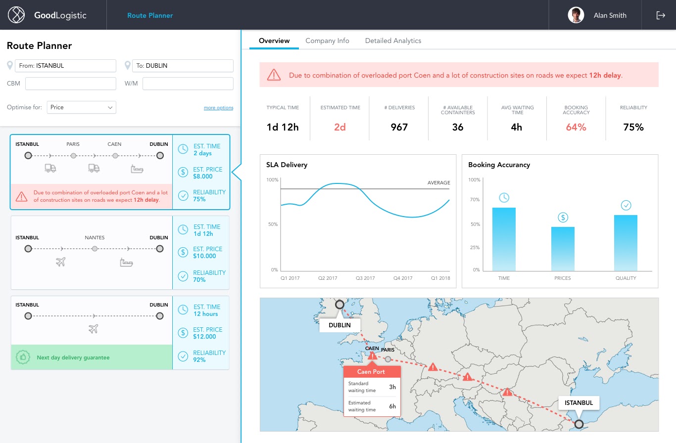
Leading ad tech platforms such as Google Ads provide a user interface that seamlessly combines a transactional campaign management user interface with analytical capabilities.
As more and more jobs are becoming data driven, the odds are that sooner or later, your customers will demand this kind of smart user interface.
Common solutions
At a glance, developing an analytical application may sound like an easy task that can be solved in one of the following ways:
- Purchase and embed a business intelligence or dashboarding tool.
- Build something from scratch using SQL, one of many visualization libraries, and some code that will glue it all together.
Both solutions have their natural pros and cons.
Business intelligence tools
Business intelligence or dashboarding tools may be appealing as their main selling point is that they enable your team to achieve a lot with a minimal impact on your engineering backlog.
In an ideal world, it works like this:
- Your data engineers prepare the data and annotate it using a tool-specific metadata language.
- Once this is done, users who are relatively non-technical can create visualizations and dashboards in a point-and-click user interface.
- An application engineer embeds the finished dashboard into the admin section of your application.
Even though this simplicity may be appealing, questions about flexibility and control immediately come to an engineer’s mind:
It may meet the requirements now. But what if our requirements change?
How much flexibility do we have if we want to change the built-in visualizations, interaction patterns, or other components?
More importantly, does it really meet the requirements?
These tools typically give you a dashboard that can be embedded into the admin section. It can support a fixed set of interaction patterns (filtering, drilling, navigating between dashboards). Will a dashboard in the admin interface make your casual business user work faster?
And how much did you say it will cost us?
SQL and charting libraries
If flexibility and control are what your team is looking for, the most obvious option is to roll up your sleeves.
The situation looks simple:
- You have data ready in your database (an application, a read replica, or even better, in a modern cloud data warehouse such as Snowflake, Redshift, or BigQuery).
- There are plenty of open source charting libraries.
- If you can write code, it must be easy.
It is actually not difficult to get started. If all you need is one screen with a few charts and there is nothing more urgent in your backlog, then this is not a bad way to start.
However, there are a couple of things to think about:
- It is easy to create static charts with a few hard-coded SQL queries, but new requirements will keep coming. Are you sure your SQL queries won’t turn into a big ball of mud or a spaghetti monster?
- The data model may change — not that frequently, but it happens. Are you ready to refactor all the complex analytical queries when it does?
- How about interactivity? Think filtering by various dimensional and numeric criteria, think drilling, think dynamic charts with user-defined measures and granularity.
Which way sounds more convincing to you? Buy or build?
Building the right way
We are developers ourselves. Our daily job is to build a platform that powers analytical applications that are used by half of Fortune 500 companies. Some of them use interactive dashboards, some of them use our data exploration tool, some of them use custom-built applications.
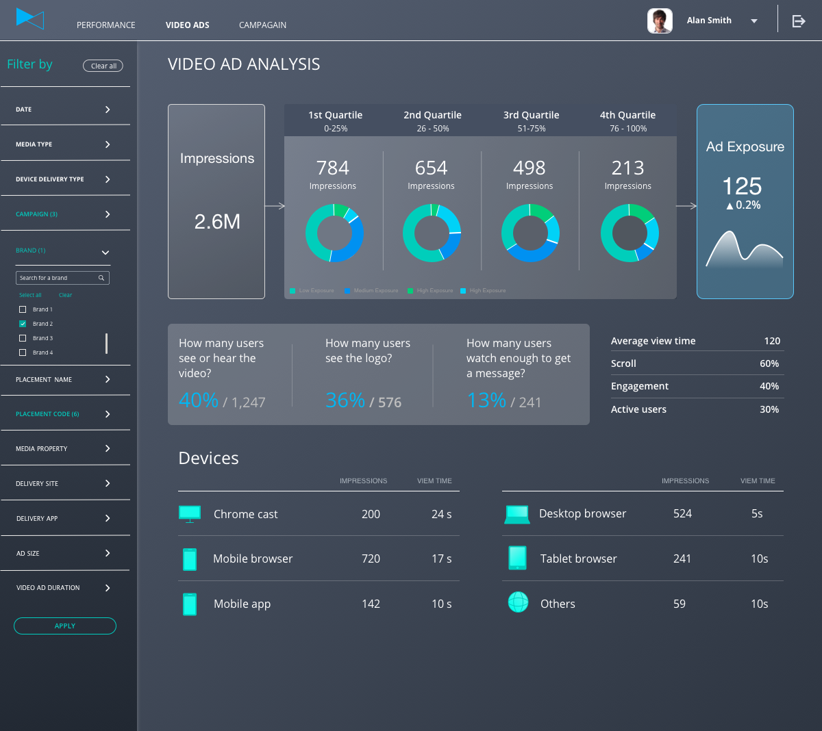
However, the point of this article is not to sell you on what we do. Instead, we would like to share some of the best practices, key principles, and tools we have developed that allow us to cover such a variety of use cases.
Let’s start with the key principles:
- Productivity: Our developers must be able to move fast.
- Flexibility and openness: Be ready for unexpected requirements.
- Developer friendliness: Fit into existing ecosystems and have good documentation and examples.
Being open and developer friendly is pretty straightforward. Let’s dive deeper into what it means to architect an interactive analytical application for developer productivity.
Architect for productivity
What is the ultimate productivity killer when building a modern web UI?
You may have the greatest component framework in the world, but you cannot move forward until the back-end part of your project is ready. Like any other development, there are two things that take time:
- Building the back-end features (anticipated)
- Redesigning the back end to fit new requirements, which always comes as a surprise… surprisingly
In other words, you want to avoid creating a brittle interface between our frontend and backend layer. Designing the contract between the front end and back end the right way is the key to productivity of front-end development.
What does that mean? The front-end engineer must be able to generate any analytical query in a way that:
- Reflects the business logic behind the query rather than technicalities of the data model. Focus on measures and granularity rather than table joins.
- Is independent of the nuances of the underlying data model. It can be normalized, denormalized, star schema, or snowflake, or it may evolve from one to another over time.
There are a number of ways that your front end can request data from the back end:
- Issue a SQL query directly: Just for the sake of completeness, we all know this is not the right way. It’s prone to security issues, harder to maintain, not speaking of the fact that not all front-end engineers have the necessary database skills.
- URL parameters: You may be tempted to just sketch out an initial set of parameters based on requirements and start quickly with queries such as /query?id=queryId&dateFrom=xxxx6dateTo=xxxx&country=yyyy but things can get really messy as the reporting requirements and implied number of parameters grow.
- Extensible API: This involves perhaps encoding the possible parameters using semi-structured format such as JSON. We’re getting there, but there are so many ways to do that. Let me share what works for us.
Solution: Attributes, filters, measures
In GoodData, we have standardized the declarative query language based on three key components: Attributes (another word for dimensions as in “dimensional modeling”), Filters, and Measures. AFM for short.
It’s a programmatic representation of the end user’s mental model. Think about all UI tools, from pivot tables in Excel to specialized analytics and data exploration tools. By the way, this is also how an analyst defines a visualization in GoodData’s Analytical Designer:
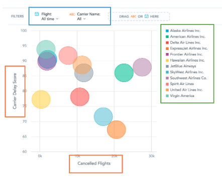
The AFM approach is a great fit to modern reactive web development frameworks such as React.js: you can easily imagine that the bubble chart above is rendered by a React.js code that looks like that:
<BubbleChart
    xAxisMeasure={cancelledFlights}
    yAxisMeasure={carrierDelayScore}
    viewBy={carrierName}
    filters={[]}
/>
The following diagram shows the full flow from a visualization and the underlying React component to the REST API of the GoodData platform:
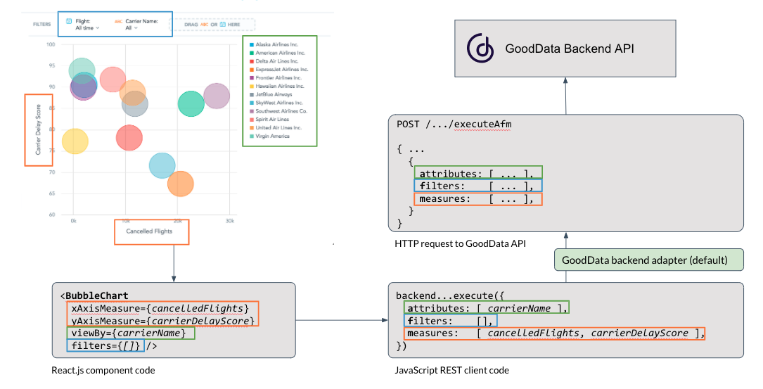
The attribute-filter-measure is a relatively common querying idiom among analytics systems, so we made the architecture pluggable. So, with a bit of JavaScript code that implements the AFM contract for a different service, your version of that diagram may look like this:
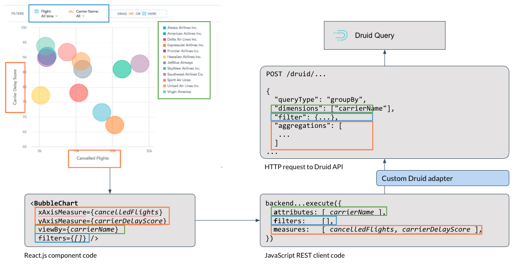
It’s simple, it maps well to your use cases, it works.
Note: On the GoodData platform, GoodData Cloud and GoodData.CN, the AFM query pattern works even with non-trivial dimensional models with multiple fact tables, conformed dimensions, and even many-to-many relationships.
Interactivity
When you think about interactivity, the AFM interface plays with React.js even better.
Do you want to let your end user drill into a data point in your chart?
Let’s have a bar chart showing revenue by month. A corresponding React component may look like
<BarChart measure={revenue} viewBy={month} />
Let’s assume the end user clicks a bar that represents August 2020 and that the value of this clicked month is assigned to the variable clickMonth.
So we simply update the component with the filter component like this:
<BarChart measure={revenue} viewBy={date} filter={createMonthFilter(clickMonth)} />
The same approach can be done if you want to let your end users switch granularity, measures, or other parameters of the chart.
Openness and extensibility
In various code samples earlier in this document, we were using specific visualization components such as <BarChart /> and <BubbleChart />.
You can imagine that your AFM enabled React library has more visualizations like that. But no visualization framework in the world will cover all visualizations you will ever need. Unless it’s extensible by design.
If you think about it, the components such as <BarChart /> or <BubbleChart /> do two things:
- They pass the AFM query to the analytical backend and retrieve the result set.
- They pass the result set (maybe with some on-the-fly transformation if necessary) to the actual charting component.
The first step (query execution) can be naturally separated into a reusable component. Let’s call it <Execute />.
With such a component, it’s no surprise that the <BarChart /> component from the previous examples can be implemented like this:
<Execute measures={measures} slicesBy={viewBy}>
  { (error, isLoading, result) } => (
     // some error handling code
     // some loading indicator handling code
     <ActualBarChartFromAChartingLibrary data={tranformForMyChartingLibrary(result)} />
  )
</Execute>
And once we have this <Execute /> component then adding it to the public API of our collection of React components is quite a natural step. You can see it in action in our code sandbox.
Integrated point-and-click development
If you are still reading, you can probably write React code and you can appreciate the flexibility of a good React.js library.
On the other hand, you usually want to start with something simple. And for quick iterations over early prototypes, writing code may look like an overkill, especially if a non-technical user can create data visualization using a point-and-click user interface.
You don’t want to type <BarChart /> every time your UI designer creates a bar chart. It is more natural to grab the identifier of whatever your point-and-click colleague created. Maybe with something like this:
<InsightView insight={id} />
An interactive example is available from here. And here you can find more about the InsightView.
Reference implementation
We said that we don’t want to discourage you from building your interactive end-user friendly analytics yourself.
If you decide to go that way, our key recommendation is to think twice before designing your API contract and consider the attributes-filters-measures approach rather than any shortcuts.
For those of you who prefer to try something proven instead of re-inventing the infrastructure from scratch, we have decided to make the reference implementation of the aforementioned architectural best practices publicly available under the MIT open-source license.
The library is called GoodData.UI, and two options are currently available from our GitHub repository:
- A fully open source implementation of the attributes-filters-measures querying pattern with pluggable back end.
- An extension of the open source library that includes Highcharts-based visualizations; since Highcharts itself is not open-source, this extension is only available under a proprietary license too. However, the source code is fully available in the GitHub repository.
Would you like to know more? Check out the following resources:
- Documentation and tutorials.
- Interactive code samples.
- Additional examples in not so interactive but comprehensive gallery.
Getting started
And if you just want to get started, you can do that in just three simple steps:
- Get a free GoodData account at www.gooddata.com/free (unless you are an existing GoodData customer).
- Type
npx @gooddata/create-gooddata-react-app@latest my-appin the terminal window. - In the newly created folder, type
yarn startto see the automatically generated skeleton of your first analytical web application with additional instructions.
A complete tutorial is available from here. If you prefer to use the standard create-react-app and add GoodData.UI library manually, check out this other tutorial.
And if you have any questions about the GoodData platform, GoodData Cloud, GoodData.CN, GoodData.UI, or just this document, feel free to ask us in our community forums at community.gooddata.com.
