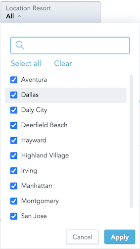
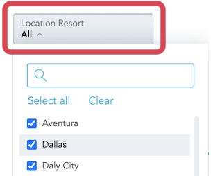
Attribute Filter Button
The Attribute Filter Button component is a dropdown component that lists attribute values.

To implement the component, choose one of the following methods:
You pass a callback function, which receives a list of the selected values when a user clicks Apply.
The component handles the change after calling itself via the
connectToPlaceholderproperty.The
onApplyfunction is not needed. UseonApplyonly if you need a specific callback to be fired.
Optionally, you can define what attribute values should be selected in the filter by default.
When implementing the Attribute Filter Button component, consider the following::
- The GoodData platform supports only filters with attribute elements defined by their URIs.
- GoodData Cloud and GoodData.CN support filters with attribute elements defined by their
primary keythat is equal to the title of the respective element.
Example
In the following example, attribute values are listed and the onApply callback function is triggered when a user clicks Apply to confirm the selection.
The onApply callback receives a new filter definition that you can use to filter charts.
import React, { Component } from "react";
import { AttributeFilterButton, Model } from "@gooddata/sdk-ui-filters";
import { newNegativeAttributeFilter } from "@gooddata/sdk-model";

import "@gooddata/sdk-ui-filters/styles/css/main.css";

import * as Md from "./md/full";

export class AttributeFilterButtonExample extends Component {
    onApply(filter) {
        console.log("AttributeFilterButtonExample onApply", filter);
    }

    render() {
        return (
            <div>
                <AttributeFilterButton
                    filter={newNegativeAttributeFilter(Md.EmployeeName.Default, [])}
                    onApply={this.onApply}
                />
            </div>
        );
    }
}
Attribute Filter Button component vs. Attribute Filter component
The Attribute Filter Button component is functionally similar to the Attribute Filter component. You can use either of them. The only difference is what the filter dropdown button looks like.

Define the default selection of values in the filter
To define the attribute values that should be selected in the filter by default, include those attribute values in the filter property. For more details about filtering, see Filter Visual Components.
    render() {
        return (
            <div>
                <AttributeFilterButton
                    filter={newPositiveAttributeFilter(Md.EmployeeName.Default, ["Abbie Adams"])}
                    onApply={this.onApply}
                />
            </div>
        );
    }
Define a parent-child relationship between two attribute filters
To define a parent-child relationship between two attribute filters, hand over the parentFilters and parentFilterOverAttribute properties to the filter that should become a child filter dependent on the other attribute filter.
The parentFilterOverAttribute property defines the relationship between the parent filter and the child filter. You specify this attribute in the child filter via either a reference to an attribute in the parent filter or a reference to any independent attribute common for a parent filter attribute and a child filter attribute. This attribute must represent the way how the two filters are connected.
You can define the parent filter as an AttributeFilter or a visualization definition placeholder.
    render() {
        <div>
            <AttributeFilterButton filter={parentFilter} fullscreenOnMobile={false} onApply={setParentFilter} />
            <AttributeFilterButton
                filter={filter}
                parentFilters={parentFilter ? [parentFilter] : []}
                parentFilterOverAttribute={idRef("attr.restaurantlocation.locationid")}
                fullscreenOnMobile={false}
                onApply={setFilter}
            />
        </div>
    }
    render() {
    <div>
        <AttributeFilterButton connectToPlaceholder={parentFilterPlaceholder} fullscreenOnMobile={false} />
        <AttributeFilterButton
            connectToPlaceholder={filterPlaceholder}
            parentFilters={parentFilterPlaceholder ? [parentFilterPlaceholder] : []}
            parentFilterOverAttribute={idRef("attr.restaurantlocation.locationid")}
            fullscreenOnMobile={false}
        />
    </div>
}
Properties
| Name | Required? | Type | Description |
|---|---|---|---|
| onApply | false | Function | A callback when the selection is confirmed by a user |
| onError | false | Function | A callback when the component runs into an error |
| filter | false | Filter | The attribute filter definition |
| parentFilters | false | AttributeFiltersOrPlaceholders[] | An array of parent attribute filter definitions |
| connectToPlaceholder | false | IPlaceholder | The visualization definition placeholder used to get and set the value of the attribute filter |
| parentFilterOverAttribute | false | ObjRef | Function | The reference to the parent filter attribute over which the available options are reduced, or the function called for every parent filter that returns such reference for the given parent filter |
| backend | false | IAnalyticalBackend | The object with the configuration related to communication with the backend and access to analytical workspaces |
| workspace | false | string | The workspace ID |
| locale | false | string | The localization of the component. Defaults to en-US. For other languages, see the full list of available localizations. |
| title | false | string | A custom label to show on the dropdown icon |
| FilterError | false | Component | A component to be rendered if component runs into an error |
NOTE: The uri property (the URI of the attribute displayForm used in the filter) and the identifier property (the identifier of the attribute displayForm used in the filter) are deprecated. Do not use them.
To define an attribute, use the filter or connectToPlaceholder property.
