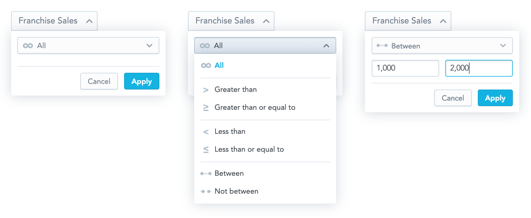
Measure Value Filter
The Measure Value Filter component is a dropdown component that allows you to create a new measure value filter or to edit an existing one. When a user clicks Apply, a callback function that contains a measure value filter ready to be used in the AFM is called.

Structure
import "@gooddata/react-components/styles/css/main.css";
import { MeasureValueFilterDropdown } from "@gooddata/react-components";

<MeasureValueFilterDropdown
  onApply={<on-apply-callback>}
  onCancel={<on-cancel-callback>}
  measureIdentifier={<measure-local-identifier>}
  filter={<filter>}
  anchorEl={<toggle-button-selector>}
  usePercentage={<percentage-measure-boolean>}
  warningMessage={<warning-message>}
/>
Example
The following example shows a bar chart displaying one measure sliced by one attribute. A user can use the Measure Value Filter component to filter the displayed bars and see the relevant data only.
import React, { Component } from "react";
import "@gooddata/react-components/styles/css/main.css";
import {
  BarChart,
  Model,
  MeasureValueFilterDropdown
} from "@gooddata/react-components";

const totalSales = Model.measure("totalSalesIdentifier")
  .format("#,##0")
  .localIdentifier("totalSales")
  .title("$ Total Sales");

const locationResort = Model.attribute(
  "locationResortIdentifier"
).localIdentifier("locationResort");

export default class SalesByResort extends Component {
    this.state = { filters: [], displayDropdown: false };

    onApply = filter => {
        this.setState({ filters: [filter], displayDropdown: false });
    };

    onCancel = () => {
        this.toggleButtonRef = null;
        this.setState({ displayDropdown: false });
    };

    toggleDropdown = e => {
        this.toggleButtonRef = !this.state.displayDropdown ? e.currentTarget : null;
        this.setState(state => ({ ...state, displayDropdown: !state.displayDropdown }));
    };

    render() {
        const { filters, displayDropdown } = this.state;

        return (
            <div>
                <div onClick={this.toggleDropdown}>Measure button</div>
                {displayDropdown ? (
                    <MeasureValueFilterDropdown
                        onApply={this.onApply}
                        onCancel={this.onCancel}
                        measureIdentifier={totalSales.measure.localIdentifier}
                        filter={filters[0] || null}
                        anchorEl={this.toggleButtonRef}
                    />
                ) : null}
                <BarChart
                    projectId={workspaceId}
                    measures={[totalSales]}
                    viewBy={[locationResort]}
                    filters={filters}
                />
            </div>
        );
    }
}
Formatting user input
To format input inside the Measure Value Filter component, use separators. The separators are controlled by the separators property that specifies the thousands separator (, by default) and the decimal separator (. by default).
For example:
<MeasureValueFilterDropdown
    ...
    separators={{ thousand: " ", decimal: "," }}
/>
Properties
| Name | Required? | Type | Default | Description |
|---|---|---|---|---|
| measureIdentifier | true | string | The identifier of the filtered measure. You can use either the local identifier or the URI. | |
| onApply | true | Function | A callback when the selection is confirmed by a user. The passed configuration of the measure value filter is already transformed into a measure value filter definition, which you can then send directly to a chart. | |
| onCancel | true | Function | A callback when a user clicks the Cancel button or makes the dropdown close by clicking outside of it. Use this callback to hide the dropdown. | |
| filter | false | Filter | null | The measure value filter definition |
| displayDropdown | false | boolean | false | Specifies whether the dropdown is opened |
| anchorEl | false | event target or string | 'body' | The element which the dropdown is aligned to; typically, your toggle button |
| usePercentage | false | boolean | false | Specifies whether the filtered measure is formatted as a percentage. If it is, the filter dropdown will accept percentage values, not the actual measure values. Set usePercentage to false when computeRatio is enabled in the filtered measure, because in this case it is filtered by actual measure values and not percentage ones. |
| warningMessage | false | string | undefined | The warning message displayed in the dropdown |
| separators | false | Separators | , for thousands; . for decimal points | Separators used for formatting strings in the input |
| locale | false | string | en-US | The localization of the component. See the full list of available localizations. |
