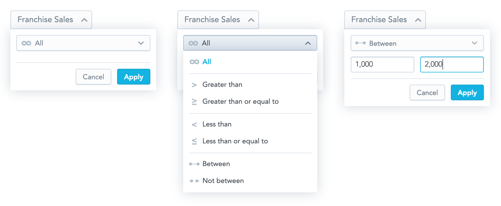
Measure Value Filter
The Measure Value Filter component is a dropdown component that allows you to create a new measure value filter or to edit an existing one. When a user clicks Apply, a callback function that contains a measure value filter ready to be used in the visualization component is called.

Structure
import "@gooddata/sdk-ui-filters/styles/css/main.css";
import { MeasureValueFilter } from "@gooddata/sdk-ui-filters";

<MeasureValueFilter
  onApply={<on-apply-callback>}
  onCancel={<on-cancel-callback>}
  filter={<filter>}
  buttonTitle={<toggle-button-title>}
  usePercentage={<percentage-measure-boolean>}
  warningMessage={<warning-message>}
/>
Example
The following example shows a bar chart displaying one measure sliced by one attribute. A user can use the Measure Value Filter component to filter the displayed rows and see the relevant data only.
import React, { Component } from "react";
import "@gooddata/sdk-ui-filters/styles/css/main.css";
import "@gooddata/sdk-ui-charts/styles/css/main.css";
import { MeasureValueFilter } from "@gooddata/sdk-ui-filters";
import * as Ldm from "./ldm/full";

const measureTitle = "$ Total Sales";

export default class SalesByResort extends Component {
    this.state = { filters: [ newMeasureValueFilter(Ldm.$TotalSales, "GREATER_THAN", 0) ] };

    onApply = filter => {
        this.setState({ filters: [filter] });
    };

    render() {
        const { filters } = this.state;

        return (
            <div>
                <MeasureValueFilter
                    onApply={this.onApply}
                    filter={filters[0]}
                    buttonTitle={measureTitle}
                />
                <BarChart
                    measures={[Ldm.$TotalSales]}
                    viewBy={[Ldm.LocationResort]}
                    filters={filters}
                />
            </div>
        );
    }
}
Formatting user input
To format input inside the Measure Value Filter component, use separators. The separators are controlled by the separators property that specifies the thousands separator (, by default) and the decimal separator (. by default).
For example:
<MeasureValueFilter
    ...
    separators={{ thousand: " ", decimal: "," }}
/>
Treating null values as 0
By default, an execution containing a measure value filter does not pass null (missing) values to arithmetic operations. However, you can allow users to make the execution treat the null values as 0 and include the null results in the filtering process.
To do so, enable the "Treat blank values as 0" checkbox in the filter dialog. By default, the checkbox is not selected.

To enable the checkbox, set the displayTreatNullAsZeroOption property to true.
To make it be selected by default, set the treatNullAsZeroDefaultValue property to true.
<MeasureValueFilter
    ...
    displayTreatNullAsZeroOption={true}
    treatNullAsZeroDefaultValue={true}
/>
Properties
| Name | Required? | Type | Default | Description |
|---|---|---|---|---|
| filter | true | Filter | The measure value filter definition | |
| onApply | true | Function | A callback when the selection is confirmed by a user. The passed configuration of the measure value filter is already transformed into a measure value filter definition, which you can then send directly to a chart. | |
| onCancel | false | Function | A callback when a user clicks the Cancel button or makes the dropdown close by clicking outside of it | |
| buttonTitle | false | string | The title of the toggle button | |
| usePercentage | false | boolean | false | If true, the filtered measure is formatted as a percentage. This means that the filter dropdown will accept percentage values, not the actual measure values. Set usePercentage to false when computeRatio is enabled in the filtered measure, because in this case it is filtered by actual measure values and not percentage ones. |
| warningMessage | false | string or object with text (string) and severity (low, medium, high) | undefined | The warning message displayed in the dropdown. severity specifies the background color of the message. |
| separators | false | Separators | , for thousands; . for decimal points | Separators used for formatting strings in the input |
| displayTreatNullAsZeroOption | false | boolean | false | If true, the "Treat blank values as 0" checkbox is shown in the filter dialog. |
| treatNullAsZeroDefaultValue | false | boolean | false | If true, the "Treat blank values as 0" checkbox is selected by default. |
| enableOperatorSelection | false | boolean | true | If true, the selection of the operator is enabled. |
| backend | false | IAnalyticalBackend | The object with the configuration related to communication with the backend and access to analytical workspaces | |
| workspace | false | string | The workspace ID | |
| locale | false | string | en-US | The localization of the component. See the full list of available localizations. |
Custom toggle button
If you want to use your own custom button for toggling the filter dropdown, use the Measure Value Filter Dropdown component. This component renders only the dropdown body outside of the current DOM tree using portals.

The component has all the same properties as the Measure Value Filter component (see Properties) with the following exceptions:
- The
buttonTitleproperty is irrelevant for the Measure Value Filter Dropdown component. - The
onCancelproperty is mandatory for the Measure Value Filter Dropdown component, because it is supposed to be used to hide the dropdown. - The Measure Value Filter Dropdown component has one additional property,
anchorEl. This optional property specifies the element that the dropdown is aligned to, which is typically your toggle button. The property can be an event target or a string and defaults to"body".
Check out our live examples for demonstration.
